


Is Civ 7's UI as Bad as They Say?

Civilization VII's Deluxe Edition launched, and the internet is buzzing – mostly about its UI. But is the online outcry justified? Let's delve into the game's interface, dissect its elements, and determine if the criticism is accurate.
← Return to Sid Meier's Civilization VII main article
Is Civ 7's UI as Bad as They Say?
Barely a day after the Deluxe and Founder's Editions launched, Civilization VII is facing criticism, primarily aimed at its user interface (and some missing quality-of-life features). While it's easy to join the chorus of complaints, let's objectively assess whether the UI truly deserves the harsh judgment. We'll break it down piece by piece, evaluating if it meets the standards of a functional, if not excellent, 4X interface.
What Makes a Good 4X UI?
Defining an "objectively good" 4X UI is tricky. A game's context, style, and goals influence UI design, making universal rules difficult. However, design principles consistently appear in successful 4X UIs. Let's use these principles to evaluate Civ VII.
Clear Information Hierarchy
A clear information hierarchy prioritizes essential gameplay information. Frequently used resources and mechanics should be prominent, while less critical features remain easily accessible. A good UI doesn't display everything at once; it organizes information logically.
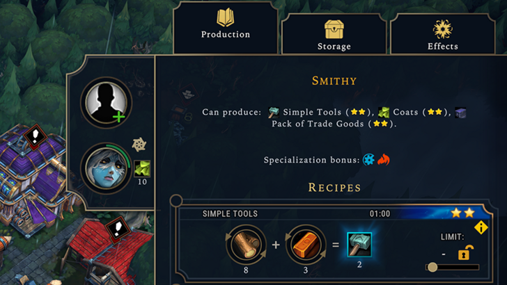
Against the Storm offers a strong example. Right-clicking a building reveals a multi-tabbed menu. The default tab focuses on common actions (worker assignment, production), while less frequent functions (inventory, Rainpunk system) are in separate tabs.
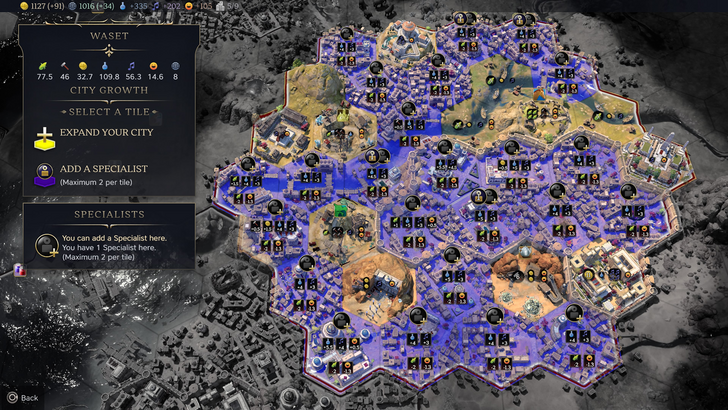
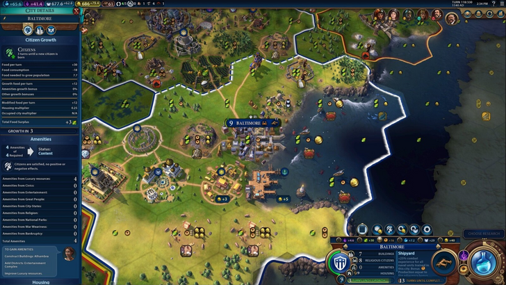
Let's examine Civ VII's resource summary. It works, but could be better.
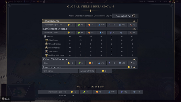
The summary displays resource allocation, separating income, yields, and expenses via dropdowns. The table format is efficient, and the menu collapses easily. However, it lacks specificity. While you see rural district contributions, the exact district or hex isn't shown. Expense breakdowns are also limited. It's functional but could benefit from more granular detail.
Effective and Efficient Visual Indicators
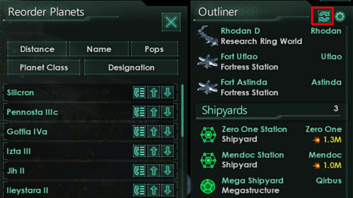
Effective visual indicators use icons and graphics to convey information quickly, minimizing reliance on text. Stellaris, despite its cluttered UI, uses visual indicators effectively in its Outliner, showing ship status at a glance.
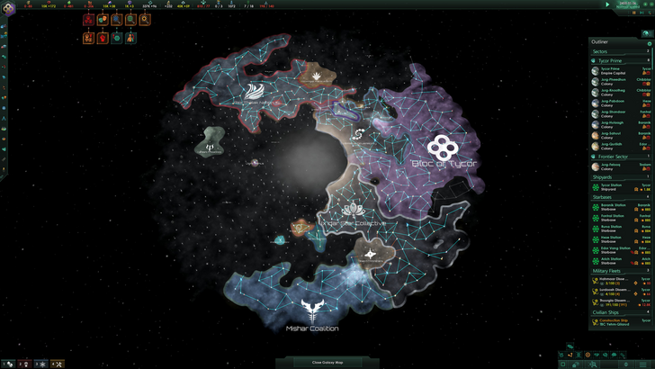
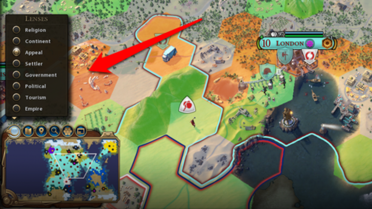
Civ VII uses iconography and numbers, but some effective indicators are present. The tile yield overlay, settlement overlay, and settlement expansion screen are all helpful. The main complaint is the absence of certain Civ VI lenses (appeal, tourism, loyalty), and the lack of customizable map pins. While not terrible, improvements are needed.
Searching, Filtering, and Sorting Options
In complex 4X games, search, filtering, and sorting are crucial for managing information overload. Civ VI's powerful search function lets players find resources, units, and more, even snapping the camera to their location.
Civ VII lacks this crucial search function, a significant usability issue. Its absence is a major drawback, hopefully addressed in future updates. Improved Civilopedia functionality would also greatly enhance navigation.
Design and Visual Consistency
The UI's aesthetic and cohesiveness are vital. Civ VI's dynamic, cartographical style enhances the overall experience.
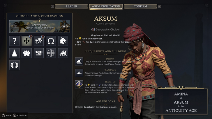
Civ VII adopts a minimalist, sleek design. The color palette (black and gold) is elegant, but the overall effect is less visually striking than Civ VI. This subtlety leads to mixed reactions, reflecting the subjective nature of visual design.
The Verdict: Not the Worst, But Room for Improvement
Civ VII's UI isn't the best, but it's not as disastrous as some claim. The missing search function is a significant flaw, but not game-breaking. Compared to other issues, the UI shortcomings seem less impactful. While it falls short of other visually striking 4X UIs, it possesses strengths. With updates and player feedback, it can improve significantly. The current state, however, doesn't warrant the extreme negativity.
← Return to Sid Meier's Civilization VII main article
Sid Meier's Civilization VII Similar Games

-
 Dec 25,24Zenless Zone Zero 1.5 Update Preview Zenless Zone Zero Version 1.5 Update: Leaked Banner Characters Revealed New leaks for Zenless Zone Zero unveil the character lineup for the upcoming Version 1.5 update, including highly anticipated character reruns. This HoYoverse action RPG continues to expand its roster of powerful characters, fr
 -
 May 06,25Magic Chess: Beginner's Guide to Mastering Core Mechanics Magic Chess: Go Go, an exhilarating auto-battler strategy game crafted by Moonton, is deeply rooted in the vibrant universe of Mobile Legends. This game masterfully blends chess tactics with hero-based strategies, offering players the chance to craft formidable team line-ups featuring heroes from th
 -
 Apr 08,25Top Free Fire Characters 2025: Ultimate Guide Free Fire, crafted by Garena, has cemented its status as a top-tier battle royale game worldwide, amassing over 1 billion downloads on the Google Play Store and engaging millions of daily active players. Its appeal lies not only in its thrilling gameplay but also in its diverse array of characters,
 -
 Jan 18,25Roblox Grace: All Commands and How to Use Them Grace 游戏指令速查 所有 Grace 指令 如何使用 Grace 指令 Grace 是一款 Roblox 游戏,玩家需要在充满恐怖生物的各个关卡中生存。游戏极具挑战性,需要玩家快速反应并寻找对抗敌人的方法。幸运的是,开发人员添加了测试服务器功能,玩家可以使用聊天指令来简化游戏,召唤敌人,或进行游戏测试。以下列出了 Grace 游戏中的所有指令以及使用方法。 所有 Grace 指令 .revive:复活指令,用于在失败或卡住时重新进入游戏。 .panicspeed:修改计时器速度。 .dozer:召唤 Dozer 实体。 .main:进入主分支服务器。 .slugfish:召唤 S