


Former Nintendo Employees Shed Light on "Angry Kirby" Phenomenon
The Evolution of Kirby's Image: From "Angry Kirby" to Global Consistency
Former Nintendo employees shed light on the fascinating evolution of Kirby's marketing in the West, explaining the shift from the "Angry Kirby" persona to a more globally consistent approach. This article delves into the reasons behind these changes and Nintendo's evolving localization strategies.
The "Angry Kirby" Phenomenon: Appealing to a Wider Audience

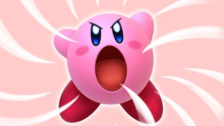
Kirby's portrayal on Western game covers and artwork often featured a more determined, even "fierce" expression—a stark contrast to his typically cute Japanese counterpart. Former Nintendo Localization Director, Leslie Swan, explained that this wasn't about portraying anger, but rather projecting determination, a trait believed to resonate more with Western tween and teen boys. This contrasted with the Japanese market, where Kirby's inherent cuteness was a major draw across all age groups. Shinya Kumazaki, director of Kirby: Triple Deluxe, confirmed this observation, highlighting the differing appeal of a "cute" versus a "tough battling" Kirby.
Marketing Kirby as "Super Tuff Pink Puff": Beyond the "Kiddie" Label
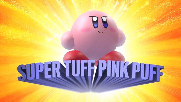
The marketing strategy further emphasized this shift. The "Super Tuff Pink Puff" tagline for Kirby Super Star Ultra on the Nintendo DS aimed to broaden Kirby's appeal, particularly among boys. Former Nintendo of America Public Relations Manager, Krysta Yang, highlighted Nintendo's desire to move away from the "kiddie" image that was perceived as a hindrance to sales. This led to a focus on Kirby's combat abilities in promotional materials, a departure from solely emphasizing his personality. While a more well-rounded character image has been pursued in recent years, Kirby's cuteness remains his primary association for many.
Regional Variations in Localization: A Historical Perspective
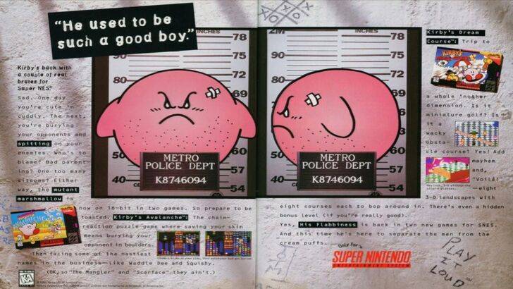
The differences in localization are evident in early marketing materials. The infamous 1995 "Play It Loud" advertisement, featuring Kirby in a mugshot, is a prime example. Furthermore, early Western releases of Kirby games often featured alterations to his appearance, notably a shift from his signature pink hue to a ghostly white in the original Game Boy Kirby's Dreamland, a decision driven by the Game Boy's monochrome screen limitations and the perceived need for a more "cool" image for a broader audience. This led to consistent changes in Kirby's facial expressions in Western box art over several years.
A More Global Approach: Consistency and Brand Identity
Both Swan and Yang agree that Nintendo has adopted a more globally consistent marketing and localization strategy in recent years, fostering closer collaboration between its Japanese and American offices. This shift aims to create a unified brand image, minimizing regional variations like those seen in Kirby's box art. While this approach ensures brand consistency, Yang acknowledges potential drawbacks, suggesting that a focus on global appeal may sometimes lead to less creative and risk-averse marketing. The changing landscape of globalization and increased familiarity with Japanese culture among Western audiences have also influenced this trend.
-
 Dec 25,24Zenless Zone Zero 1.5 Update Preview Zenless Zone Zero Version 1.5 Update: Leaked Banner Characters Revealed New leaks for Zenless Zone Zero unveil the character lineup for the upcoming Version 1.5 update, including highly anticipated character reruns. This HoYoverse action RPG continues to expand its roster of powerful characters, fr
 -
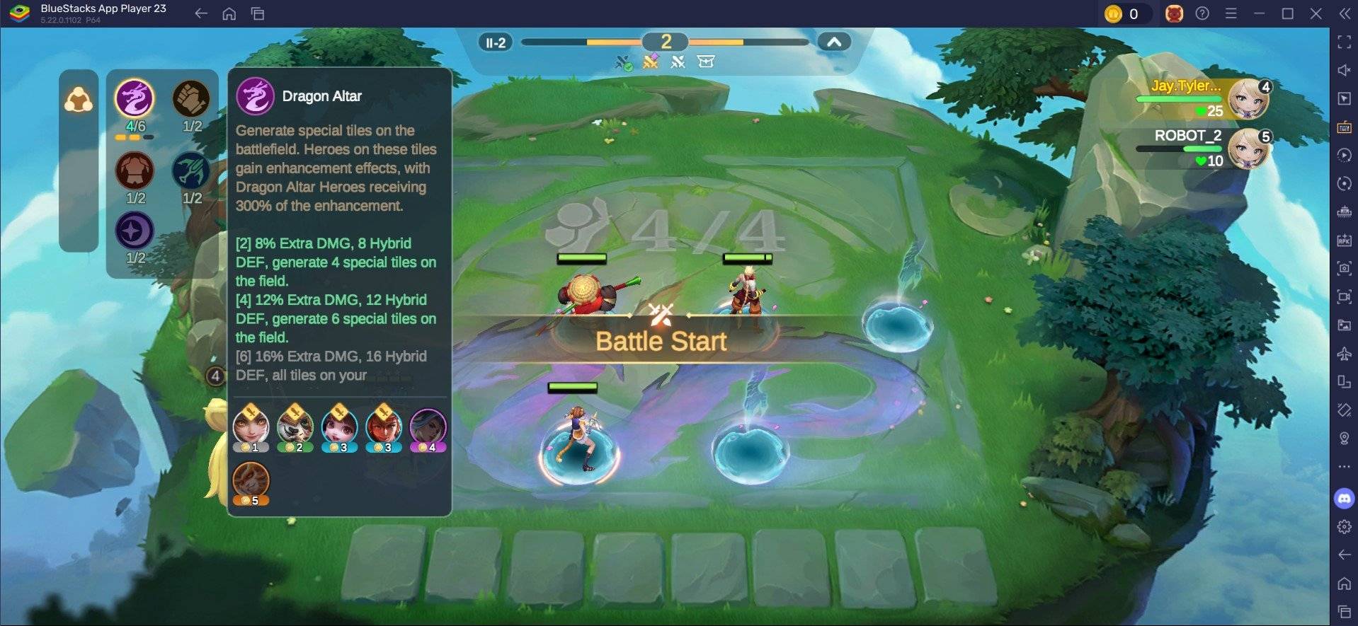 May 06,25Magic Chess: Beginner's Guide to Mastering Core Mechanics Magic Chess: Go Go, an exhilarating auto-battler strategy game crafted by Moonton, is deeply rooted in the vibrant universe of Mobile Legends. This game masterfully blends chess tactics with hero-based strategies, offering players the chance to craft formidable team line-ups featuring heroes from th
 -
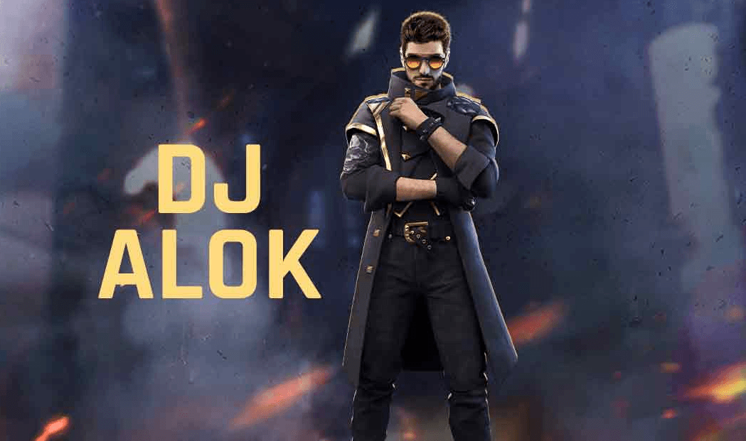 Apr 08,25Top Free Fire Characters 2025: Ultimate Guide Free Fire, crafted by Garena, has cemented its status as a top-tier battle royale game worldwide, amassing over 1 billion downloads on the Google Play Store and engaging millions of daily active players. Its appeal lies not only in its thrilling gameplay but also in its diverse array of characters,
 -
 Jan 18,25Roblox Grace: All Commands and How to Use Them Grace 游戏指令速查 所有 Grace 指令 如何使用 Grace 指令 Grace 是一款 Roblox 游戏,玩家需要在充满恐怖生物的各个关卡中生存。游戏极具挑战性,需要玩家快速反应并寻找对抗敌人的方法。幸运的是,开发人员添加了测试服务器功能,玩家可以使用聊天指令来简化游戏,召唤敌人,或进行游戏测试。以下列出了 Grace 游戏中的所有指令以及使用方法。 所有 Grace 指令 .revive:复活指令,用于在失败或卡住时重新进入游戏。 .panicspeed:修改计时器速度。 .dozer:召唤 Dozer 实体。 .main:进入主分支服务器。 .slugfish:召唤 S